
Back to projects
2021 - 2022

A clearer website for hearing decisions

Restructured a large healthcare website and shaped a more consistent design system so visitors could find relevant hearing information with less friction.

My role

Lead UX Designer

Category

Medtech website

Period

2021 - 2022

A clearer website for hearing decisions Background
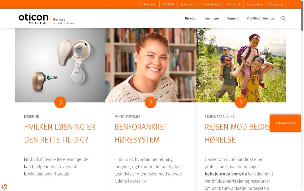
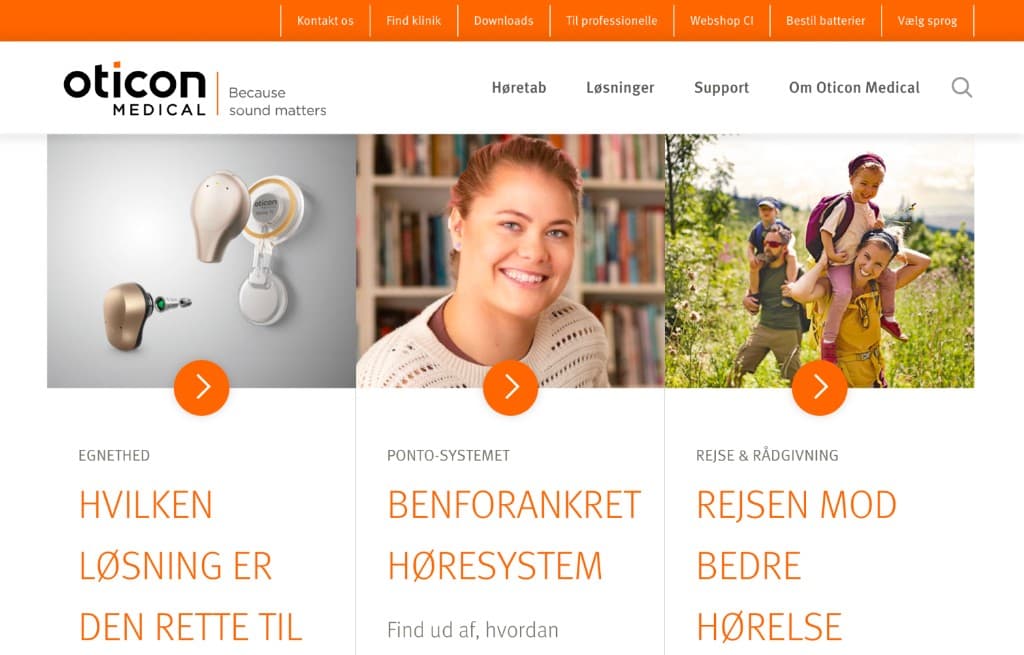
Oticon Medical already had a recognizable visual identity, but the website had grown into a large collection of overlapping, outdated, and sometimes confusing pages. People visiting the site were often looking for sensitive information about hearing solutions, support, and next steps, so the experience needed to feel calmer and much easier to navigate.
A clearer website for hearing decisions The challenge
The hard part was not simply removing pages. It was understanding what information different visitors actually needed, how they thought about their situation, and how they could reach the right content without being pushed into a large tangled structure.
A clearer website for hearing decisions How we worked
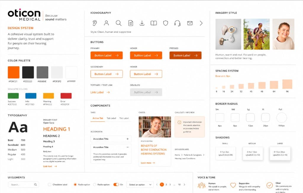
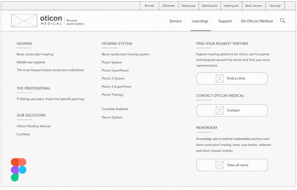
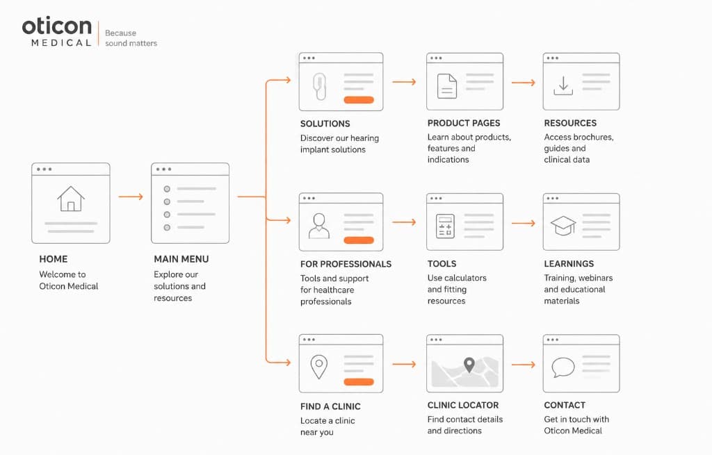
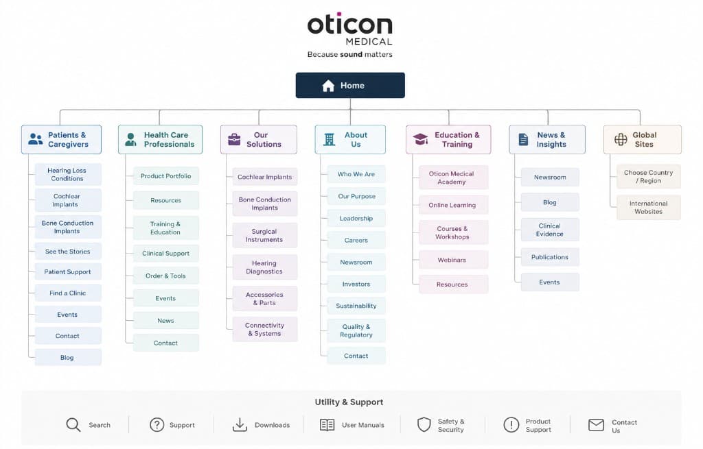
I worked through the existing site structure, cleaned up content patterns, and used the current brand expression as the foundation for a more consistent design system. The work moved between information architecture, page concepts, content cleanup, and practical components that could support the team after the redesign.
A clearer website for hearing decisions Key decisions
  • Restructure navigation around the questions visitors came with instead of the internal way the organization was divided.
  • Create repeatable page sections so editorial work could stay consistent without making every page feel templated.
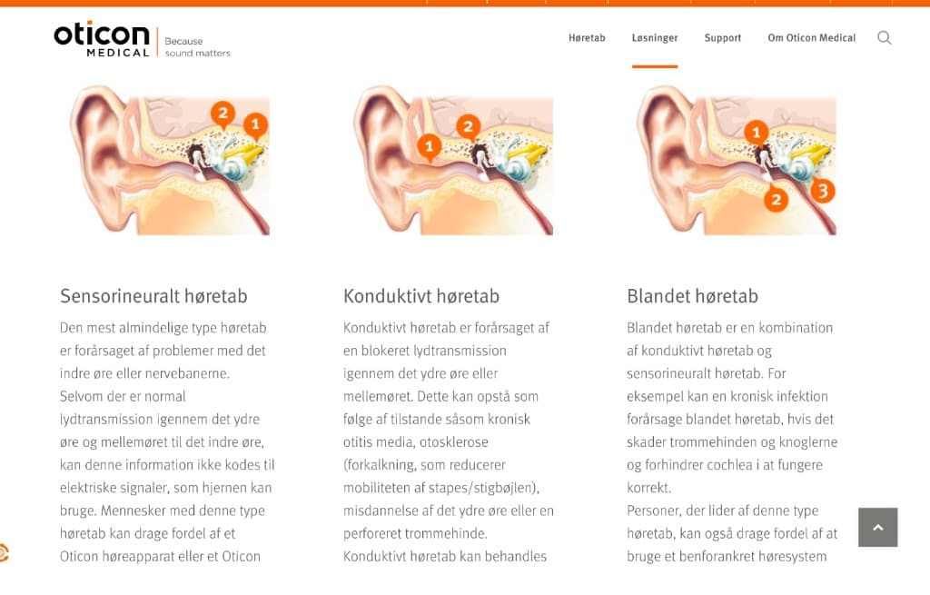
  • Remove or merge outdated content where it created doubt, duplication, or unnecessary detours.
A clearer website for hearing decisions The outcome
The result was a clearer website structure and a more coherent design system that still felt like Oticon Medical. Pages became easier to scan, content had a more predictable rhythm, and the site could guide visitors toward relevant information with less friction.
A clearer website for hearing decisions What changed
The team gained a stronger foundation for future pages and a more useful way to discuss content: not as isolated pages, but as connected journeys that had to help customers and visitors move forward.
A clearer website for hearing decisions What stayed with me
This project reinforced how much information architecture matters in healthcare. When people are making personal decisions, clarity, pacing, and trust often matter more than adding another persuasive element.

Next project

Admin software for sailing clubs