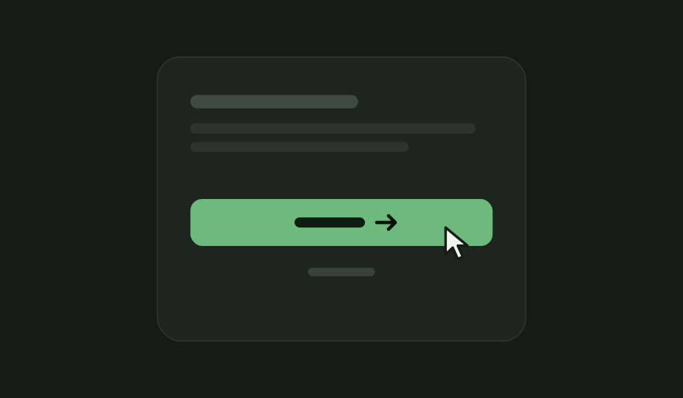
Give people one clear next step
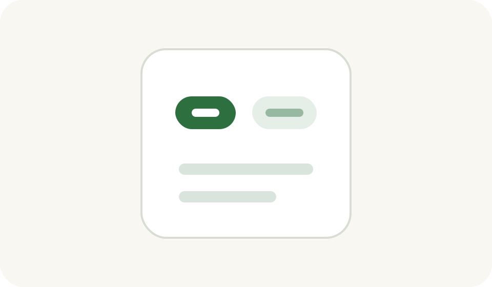
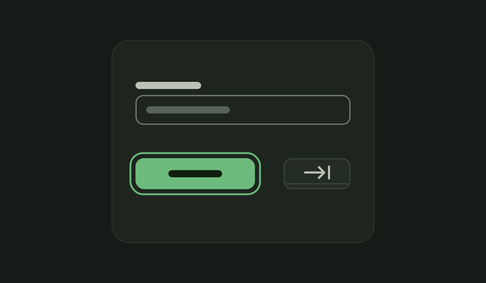
Every screen should answer: what can I do now? Make the main action obvious, then let the secondary actions stay quiet.
Research-backed reminders rewritten in plain language for forms, flows, empty states, and everyday product decisions.
Every screen should answer: what can I do now? Make the main action obvious, then let the secondary actions stay quiet.
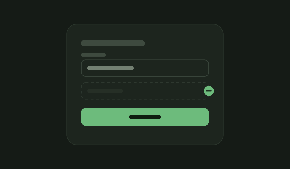
Each extra question adds work. Remove anything you can infer, ask later, or do not truly need.

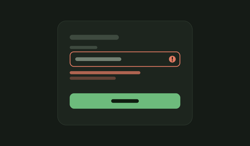
Put the message next to the problem, keep the user’s input, and say exactly how to fix it in human language.
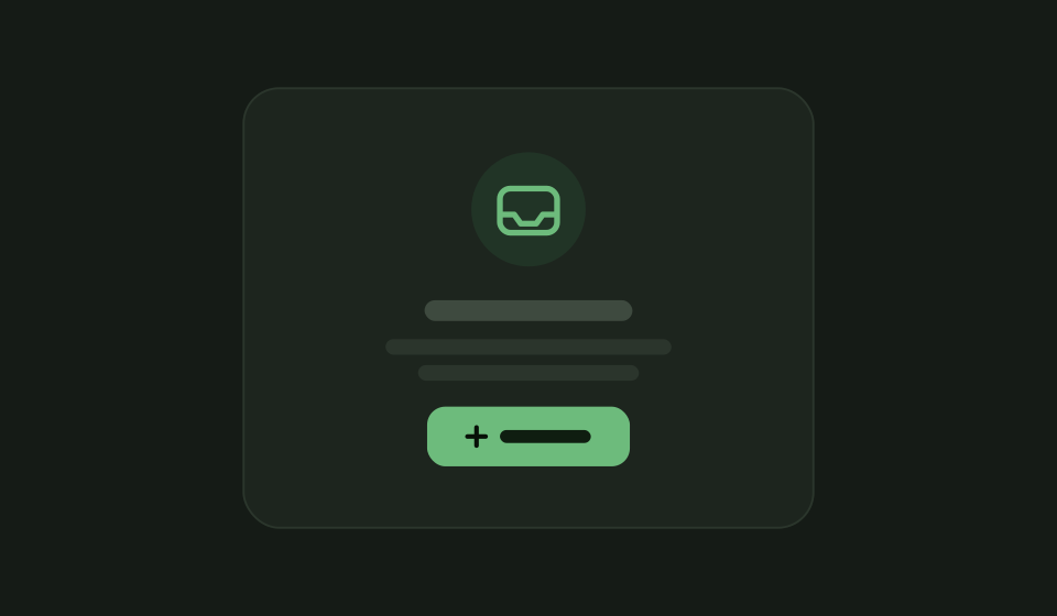
A blank screen still has a job. Explain why it is empty and offer one useful way to continue.
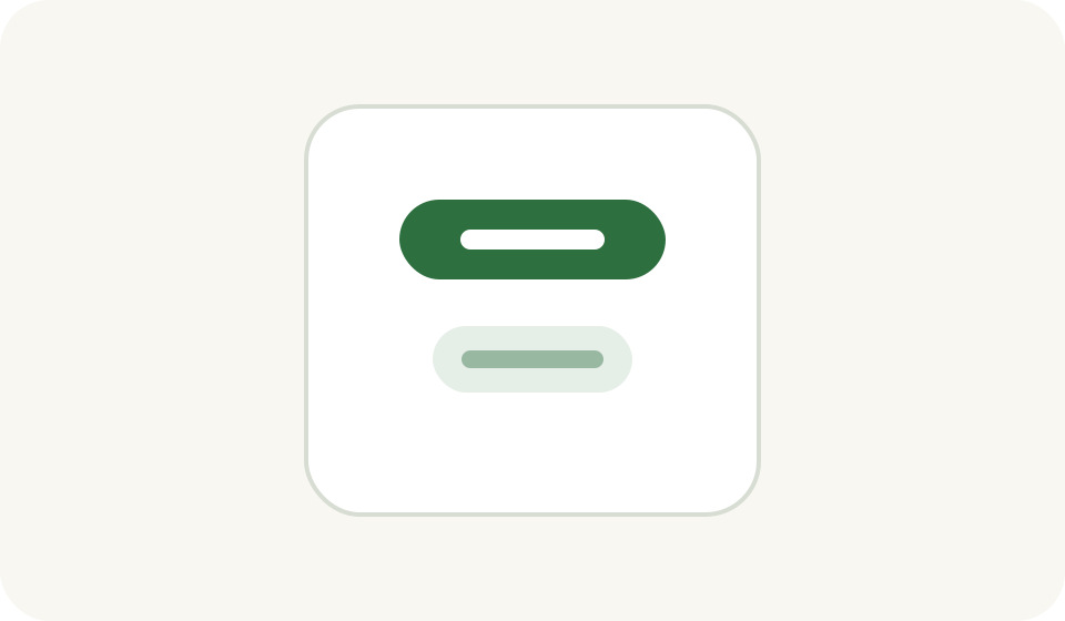
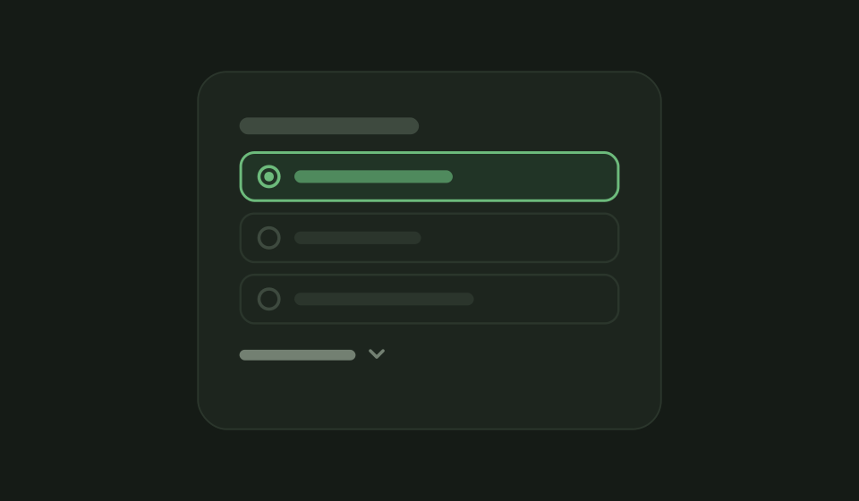
Too many options slow people down. Group related things, show the common path first, and reveal advanced choices only when needed.
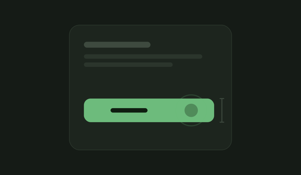
Primary buttons should be close to where attention already is, large enough to tap, and visually hard to miss.
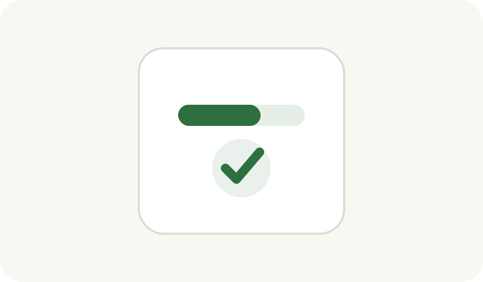
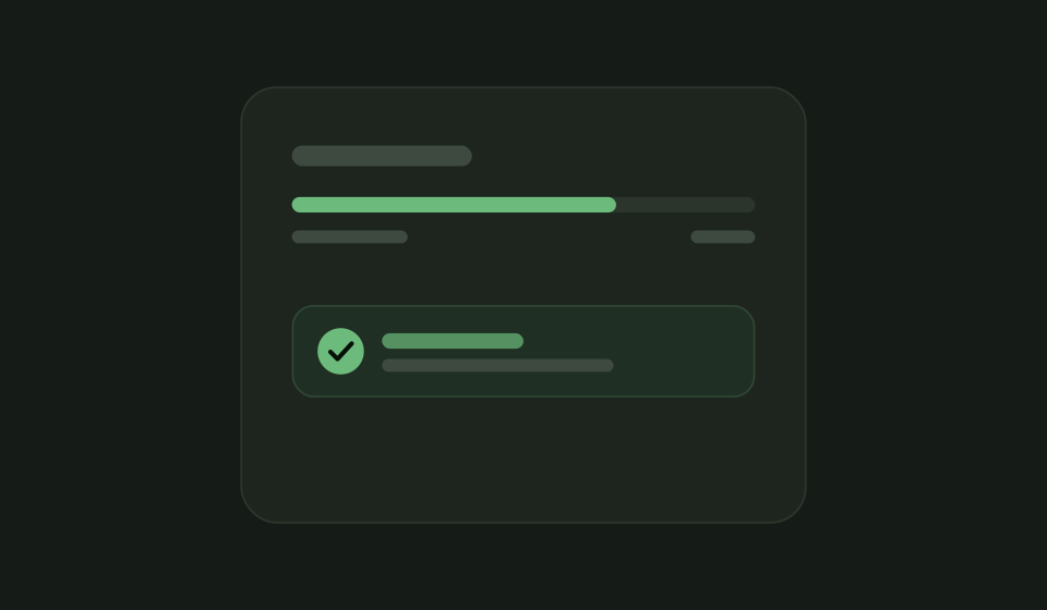
Use progress, loading, saved, and success states so people know the system heard them and what changed.
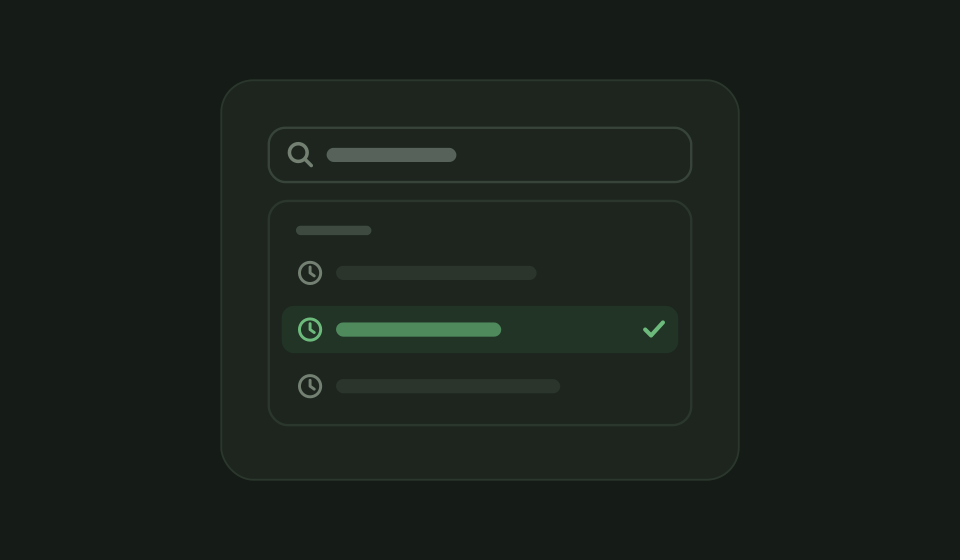
Keep labels, choices, and recent context visible. Do not make people carry details from one screen to the next.
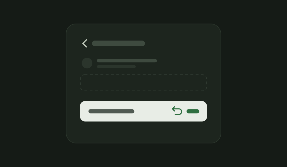
Undo, cancel, back, and edit links make people more confident because mistakes do not feel final.
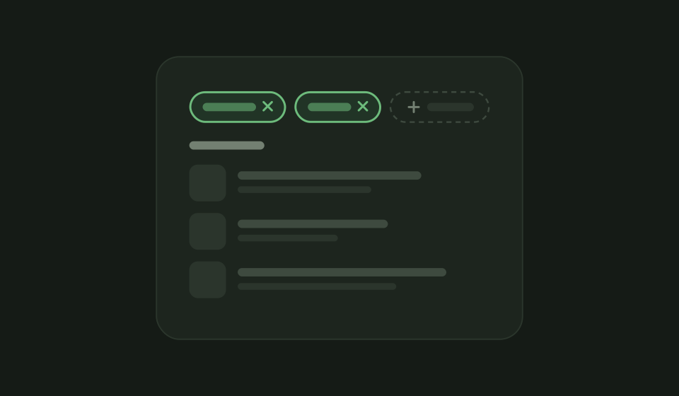
Show active filters as chips, include result counts, and make each filter easy to remove without starting over.
Clear contrast, keyboard focus, labels, and readable text help more people use the product in more situations.
Whether it is a full-time role or a focused UX challenge, a short call is usually enough to see if there is a useful next step.