
Back to projects
2024

Faster choices for life on the road

Explored a mobile travel concept that helps people compare overnight spots quickly while still surfacing the details they need to choose confidently.

My role

Product Designer

Category

Travel app

Period

2024

The travel app concept explored how people on the road choose places to stay when they are already moving. In that moment, the product has to help users compare distance, facilities, reviews, surroundings, and trust without turning every stop into a research project.
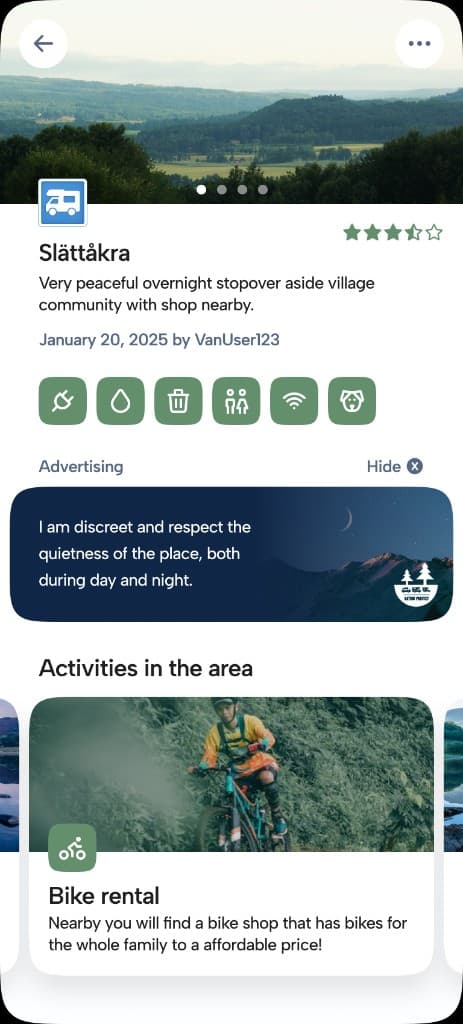
The challenge was to balance map discovery with confident decision-making. Travelers need quick answers, but they also rely on details like photos, rules, facilities, and recent reviews before they feel comfortable choosing a place.
I worked through the mobile journey from map browsing to shortlisting and final selection. The design explored how much information belongs in the map view, what should be summarized on place cards, and when to move into a richer detail page.
  • Make location, distance, and core facilities visible early so users can compare places quickly.
  • Keep reviews, restrictions, and trust signals close to the decision instead of burying them below media.
  • Design transitions so users can inspect a place without losing their map context or sense of alternatives.
The result was a mobile concept that combines map discovery, compact comparison cards, and detail screens that support the final decision. Each layer has a clear job, from browsing broadly to choosing confidently.
The work made the planning flow easier to discuss because the interface separated quick comparison from deeper evaluation. That made trade-offs around density, trust, and speed more visible.
Travel UX is not only about showing more options. Often the better experience is the one that helps people understand enough to choose, then get back to the trip.

Next project

Local skate sessions without the admin